Ecommerce Marketing·Sep 9, 2026
Use a practical hook, product demonstration, proof, and CTA structure to plan a clear 15-second product video ad for ecommerce.
By Sprokl Team
A 15-second product video ad has very little room for explanation. The goal is not to squeeze every feature into the edit. It is to make one buyer question easy to understand: what is the product, why might it matter in this situation, and what should the viewer do next?
The most useful way to plan a 15 second product video is as a sequence of jobs. The opening earns attention, the middle makes the product legible, and the close gives the viewer a clear next step. This is a planning framework, not a performance formula. A short ad still needs accurate product claims, permissioned assets, readable captions, and a review pass.
Before choosing shots, decide the single message the video should carry. A product video may demonstrate a mechanism, answer an objection, show a use case, or frame a product benefit. It usually cannot do all four well in 15 seconds.
Choose one primary job:
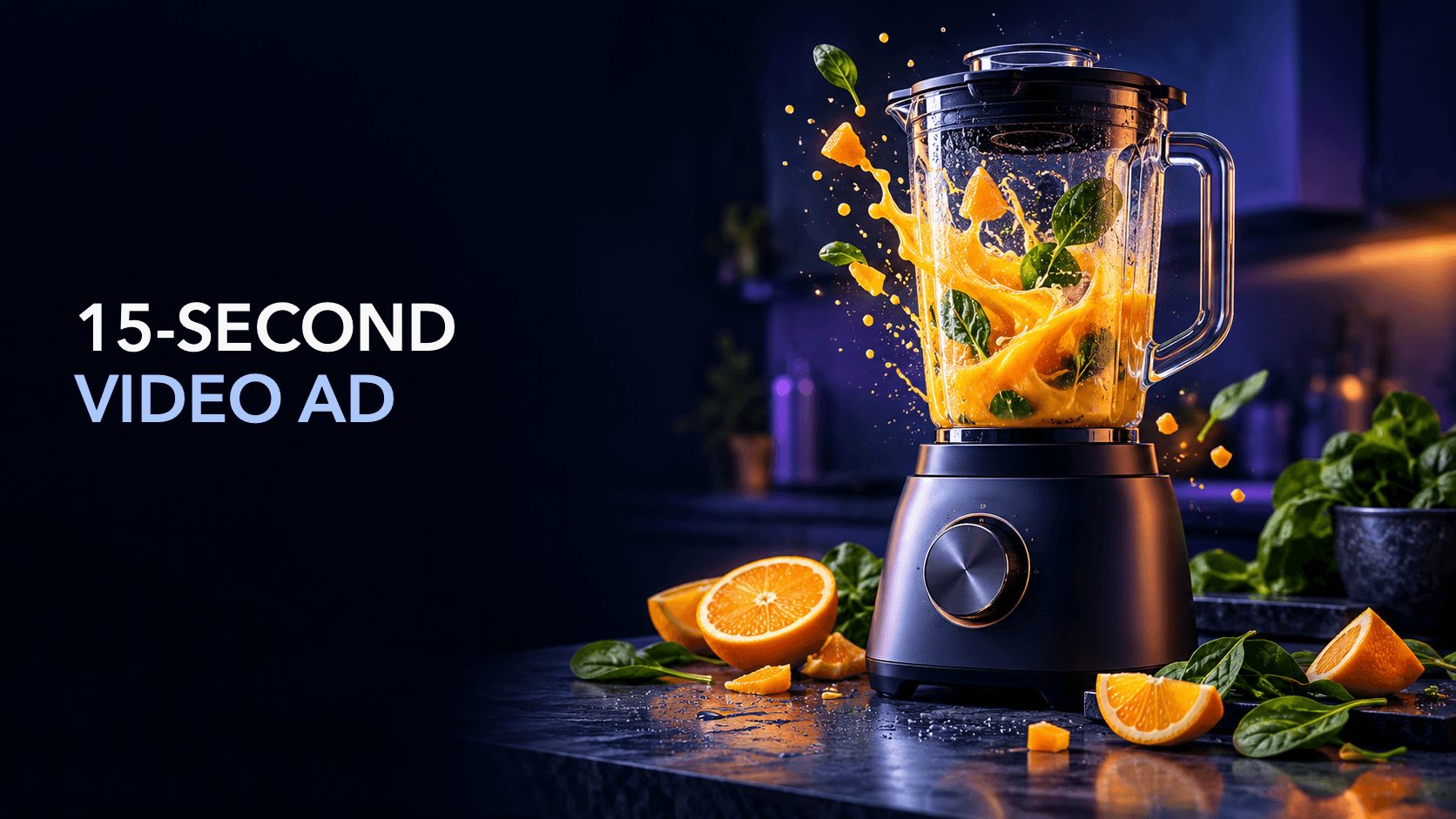
For example, a fictional countertop blender might use a demonstration angle: show the ingredients entering the vessel, the blend action, and the finished drink. It does not need to explain every speed setting, motor specification, cleaning instruction, and recipe in the same cut.
This narrower approach is consistent with the broader product video advertising workflow: start with the buyer question, then choose the footage and message that answer it.
TikTok’s creative guidance uses a hook, body, and close structure for short-form ads. That is useful for a 15-second product video because it turns a vague duration into three editorial jobs.
| Time | Job | What to show | What to say or caption |
|---|---|---|---|
| 0–3 seconds | Hook | A problem, action, question, or unexpected product detail | Name the situation or value clearly |
| 3–11 seconds | Body | The product in use, one key detail, and visible proof | Explain the relevant benefit without stacking claims |
| 11–15 seconds | Close | Product, brand cue, and next action | Tell the viewer what to do next |
These ranges are starting points, not rules. A product that needs a longer demonstration may use more of the middle. A simple product may need a faster reveal. The important test is whether the viewer can identify the product and message before the CTA arrives.
The first frame does not need a large logo card. It needs a meaningful signal. Start with one of these patterns:
Keep the hook honest. A dramatic opening should lead to evidence in the body, not to a broader promise than the product can support. Use captions so the central idea remains understandable when sound is off.
The body should answer the hook with one clear sequence. A useful order is:
For a fictional travel pouch, that might be: the pouch enters a crowded bag, its compartments open, and three cables are placed inside. The footage supports a specific observation about organization. It does not automatically support a claim that the pouch solves every packing problem.
Product visibility matters here. Do not let fast transitions, decorative overlays, or lifestyle footage obscure the item. If the product has a mechanism, give the camera a stable enough moment for the viewer to inspect it.
The final seconds should not introduce a second message. Repeat the product cue and choose a CTA that matches the level of understanding:
The CTA should be visible, readable, and supported by voiceover or sound when appropriate. Google’s ABCD guidance treats direction as a distinct part of effective video creative; the practical lesson is to say what you want the viewer to do rather than ending on an ambiguous logo screen.
Use this six-shot template when you have enough source footage for a clear demonstration:
You can combine shots when the source footage is strong. A close-up may be the hook and the proof at once. A creator walkthrough may cover the reveal and use shot. What matters is not the number of cuts but the clarity of the sequence.
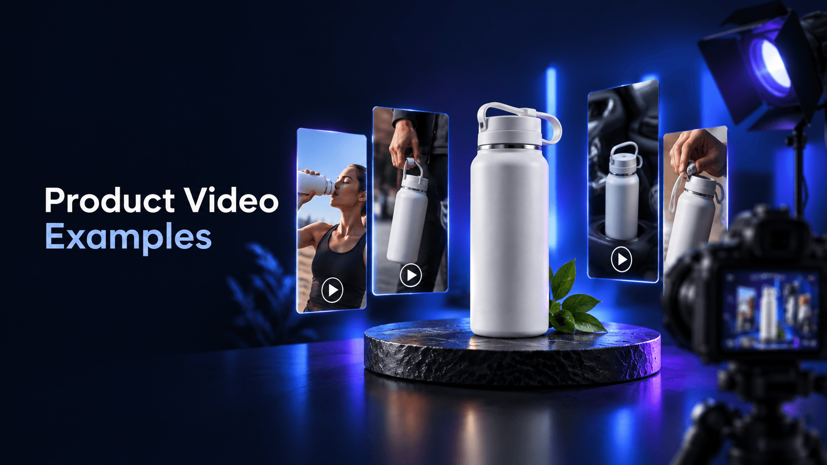
For more format ideas, see product video examples. Choose the format based on the buyer question instead of adding every available angle to one edit.
Fast pacing is not the same as useful pacing. A viewer should have enough time to understand each important action. Review the cut with these checks:
TikTok’s current creative guidance recommends vertical, mobile-first video, captions, and a hook/body/close structure. Those are useful production constraints for short-form placements, but a 15-second cut may also be adapted for other placements with different safe zones, sound behavior, and cropping. Make the master edit clean, then create placement-specific versions when necessary.
Sound can carry explanation, rhythm, and emphasis. Use dialogue, voiceover, music, or natural product sound only when it supports the message. Do not rely on sound alone: captions and visual context make the ad more accessible and more resilient to muted playback.
Branding should be recognizable without taking over the hook. Use the product, packaging, color, voice, or a restrained logo cue where it naturally belongs. A large logo card at the beginning can consume the exact seconds needed to explain the product. A repeated product cue in the body and a clear brand/CTA close usually create a more coherent sequence.
For the broader building blocks of message, product presentation, proof, and variation, see ad creative.
The hook/body/close model can support different creative angles:
Use this when the product solves a visible inconvenience. Show the problem, demonstrate one response, and direct the viewer to learn more. Keep the problem specific and avoid turning a small convenience into a universal outcome.
Use this when customers repeatedly ask about fit, setup, size, texture, or use. Put the question in the opening caption, answer it with an observable shot, and point to the relevant detail page.
Use this when the finished state is visually clear. Show the result briefly, reveal the product action that produced it, and close with a direct next step. Make sure the “result” is a truthful representation of the product and conditions shown.
These are structures to adapt, not scripts to copy. The same format can work differently depending on the product, audience, assets, offer, and placement.
One 15-second ad is rarely the only useful version. Build variations by changing one meaningful variable at a time:
Keep the underlying claim and product behavior consistent while changing the creative angle. Record which version changed, what buyer question it targets, and what evidence appears in the cut. That makes later review more useful than simply producing a folder of near-duplicates. The creative testing framework can help organize that comparison.
Sprokl can support this planning workflow by generating ecommerce creative angles, hooks, scripts, and video-ad variations from product assets and brand information. Treat generated directions as starting points: product facts, permissions, brand standards, accessibility, and final creative judgment still need review. You can explore the AI video ad generator or start with Sprokl.
Before you use a 15-second product video ad, confirm:
A good short product video is not a compressed catalog. It is a focused answer: one situation, one product message, enough proof to make it understandable, and a clear next action.
Keep exploring

Make the next creative move
Build, test, and iterate on ecommerce ad creatives faster with AI-powered concepts, scripts, and variations.