
Ecommerce Marketing·Sep 9, 2026
Build a practical creative strategy for ecommerce advertising by connecting the customer problem to an angle, message, format, hook, variations, and a learning loop.
By Sprokl Team
Creative strategy is the set of decisions that determines what an ad should say, show, and help a shopper understand. It connects a customer problem to an angle, message, format, hook, and a set of variations that a team can review and test.
For ecommerce teams, that connection matters because more production does not automatically create better creative. A folder full of product photos, scripts, and edits can still lack a clear reason for each ad to exist. A useful strategy gives every asset a job while keeping the product truth, approved claims, and buyer context visible.
This guide explains a practical creative strategy for ecommerce advertising. It focuses on creative decisions—not bidding, targeting, campaign setup, or promises of performance. The examples are fictional unless a source is named.
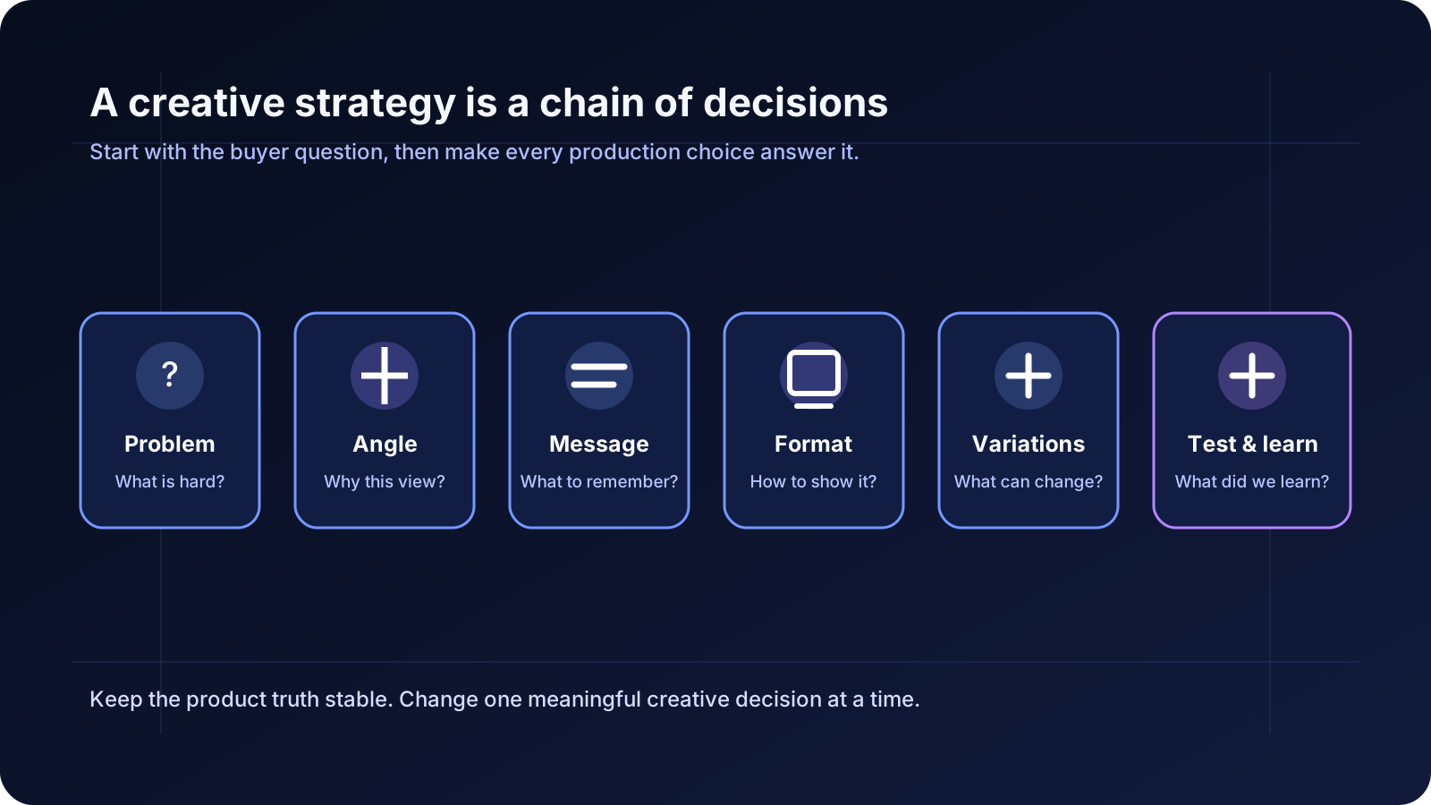
An ecommerce creative strategy answers seven questions:
This is different from a creative brief, although a brief can document the strategy. It is also different from creative testing. Testing is one part of the loop; strategy explains what you are testing and why.
Platform guidance points in a similar direction. TikTok describes ad creative as a combination of visual, sound, and storytelling choices, and recommends testing different hooks and captions. Meta guidance also recommends testing multiple images and videos and refreshing creative when audiences see the same assets repeatedly. Those recommendations are useful directional inputs, not guarantees that a particular concept will perform.
Do not begin with “What video should we make?” Begin with “What is the buyer trying to solve, understand, or decide?”
For a reusable water bottle, the relevant problems might be:
These are not interchangeable. Each one suggests a different proof point and production choice. “Stay hydrated” is broad; “Will this fit in my cup holder?” is a concrete buyer question that an ad can answer.
Write the problem as an observable situation, not a demographic label. “Busy professionals” is a segment description. “People carrying a bottle from a train platform to a desk” gives the creative team a scene, a tension, and a possible product demonstration.
An angle is the point of view that makes a product relevant to a specific problem. It is broader than a hook and more directional than a feature list.
For the bottle, possible angles include:
The same product can support several angles if the evidence and product information support them. The goal is not to invent endless angles. It is to select a few meaningful reasons a person might care, then express each one clearly.
Sprokl's creative angles feature is designed around this kind of audience, problem, benefit, and storytelling direction. Any generated direction still needs review against the product's approved claims.
The message is the takeaway you want the viewer to retain after the ad. It should be specific enough to guide the edit and modest enough to support with evidence.
For the fit angle, a message might be: “See whether the stated bottle dimensions fit the cup holder you use.” That is less dramatic than “The perfect bottle for every car,” but it is clearer and easier to verify.
A simple message hierarchy helps:
Do not make every feature a headline. When every element is treated as equally important, the viewer has to build the hierarchy themselves. Product advertisement examples cover a related way to connect product presentation, proof, and action without inflating a claim.
Format is not decoration. It determines how the audience receives the message.
For example, a cup-holder fit question may work as a close, stable demonstration with dimensions on screen and a link to the size details. A cleaning question may benefit from a sequence of lid, seal, and washing steps. A routine angle may work better as a short day-in-the-life sequence.
Format choices should also account for placement requirements such as aspect ratio, captions, safe zones, sound, and legibility. Google Ads guidance warns that repetitive or unreadable overlaid text can weaken an asset; the broader lesson is to keep the visual focused on the product and the message easy to parse.
A hook is the opening device that gives someone a reason to keep watching or reading. It can be a question, a product action, a problem scene, a surprising detail, or a concise statement.
Useful hook patterns for the bottle include:
The hook should connect to the message. A dramatic opening that never resolves into product information may earn a pause but create confusion. Avoid unsupported superlatives such as “the only bottle you need” or “leakproof forever” unless the exact claim is substantiated and approved.
Variation is useful when it creates a learning opportunity. Changing everything at once makes it difficult to understand what the team learned.
For one bottle concept, a structured variation set might be:
The product truth stays stable while the opening or context changes. Another batch could keep the hook stable and change the format from a demonstration to a carousel. Name each version by the decision it represents, not by a vague file name like final-final-3.mp4.
This is where a production system can help. Sprokl supports generating creative angles, ad scripts, messaging frameworks, and multiple video-ad variations from product assets and brand information. It does not replace the team's product, brand, legal, or claims review.
Testing should begin with a hypothesis: “A fit-first opening will make the product easier to evaluate than a generic lifestyle opening.” Define the comparison, keep the relevant conditions as consistent as possible, and decide what evidence will inform the next creative decision.
Testing one meaningful variable at a time can make the result easier to interpret, although the exact test design depends on the channel, objective, budget, and available data. A click signal can indicate interest in the message; it does not by itself prove product-market fit or profitable sales.
After review, record the learning in plain language:
For a deeper testing methodology, see How to Build a Creative Testing Framework for Ecommerce Ads. This article's focus is the upstream strategy that gives those tests a meaningful structure.
Imagine a fictional ecommerce brand selling a compact desk lamp. The product has an adjustable arm, three brightness settings, and a USB-C power connection. The team wants more ad concepts but does not want a generic “better desk setup” montage.
Direction one: solve a visible workspace problem
Direction two: answer a product-selection question
Direction three: make the feature tangible
The directions are different because they answer different buyer questions. They are not three random visual styles applied to the same sentence.
Once the direction is clear, document it in a compact brief:
The advertising creative brief template can help turn this into a reusable handoff. Keep the brief short enough that a producer can use it while building, and precise enough that a reviewer can tell whether the final asset followed the strategy.
“We need a UGC video” is a production request, not a strategy. The format should follow the explanation the buyer needs.
“The commute” can be an angle. “Does it fit in your work bag?” can be a hook. Keeping the levels separate gives the team more useful variations.
Ten edits that say the same vague thing do not create ten strategic options. Change the buyer question, angle, or message before multiplying outputs.
Motion, transitions, and trend references can support a message, but they cannot substitute for product clarity. The viewer should understand what is being offered and why the scene matters.
Avoid turning a demonstration into a universal promise. Show the condition, state the limitation, and route the viewer to the detail that supports the decision.
If a team only labels one asset a winner, it loses the insight that could improve the next concept. Record what changed, what was observed, and what remains uncertain.
For a small ecommerce team, a practical weekly cadence can look like this:
The schedule is less important than the handoff between decisions. A message should survive into the script, the script into the edit, and the edit into the review notes.
Sprokl supports the creative-production layer of this process: teams can use product assets and brand information to develop ecommerce ad concepts, creative angles, hooks, scripts, messaging frameworks, and video-ad variations. That can make it easier to explore several directions before production and organize a batch around clear decisions.
Use Sprokl as part of a reviewed workflow, not as a substitute for judgment. Product facts, claims, brand requirements, permissions, and final creative quality still belong with the team. To explore the workflow, see Ecommerce Ads, AI Ad Scripts, and Video Variations.
Before producing or testing an ecommerce ad, ask:
Creative strategy becomes useful when it makes the next decision easier. Start with the buyer's question, keep the product truth visible, and create variations that teach the team something specific.
Keep exploring

Make the next creative move
Build, test, and iterate on ecommerce ad creatives faster with AI-powered concepts, scripts, and variations.