
Ecommerce Marketing·Sep 19, 2026
Study practical Facebook ad examples by hook, product presentation, proof, pacing, CTA, and creative variation—with safe ways to adapt each pattern for ecommerce.
By Sprokl Team
The most useful Facebook ad examples are not just a collection of attractive images and videos. They are examples of decisions: how a brand opens the message, presents the product, supports a claim, controls the pace, and asks for the next action.
That makes ad examples more useful for an ecommerce team. Instead of copying a competitor's layout or wording, you can study the underlying creative pattern and make an original version for your own product, audience, and approved claims.
This guide breaks down ten Facebook ad creative patterns by hook, product presentation, proof, pacing, CTA, and variation. The examples are fictional unless a public source is named. They are creative observations—not performance guarantees—and this article does not cover Ads Manager setup, bidding, targeting, or campaign configuration.
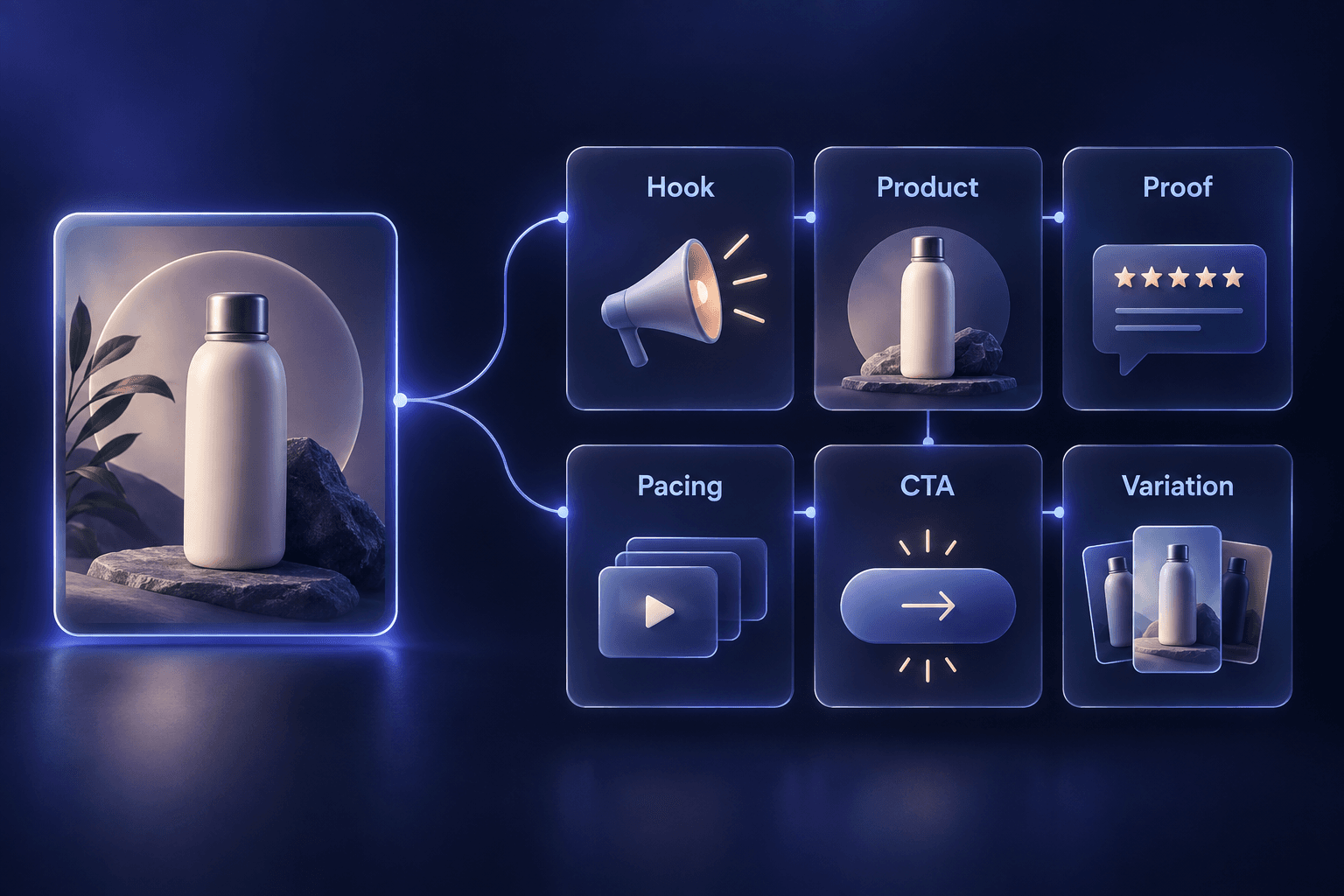
Before asking whether an ad is “good,” ask what it is helping the viewer understand. A practical review has six parts:
This is a creative analysis lens, not a formula. A static image may communicate the product and proof at once. A carousel can spread one explanation across cards. A short video may need a clear opening action before the viewer has context. Meta's guidance for Reels, for example, discusses mobile-native vertical video, audio, safe zones, and testing; those are placement-specific considerations, not rules that make every Facebook ad format perform the same way. (Meta for Business: Instagram & Facebook Reels ads)
Example: A fictional cable-organizer brand opens on a drawer of tangled charging cords. The next shot shows the organizer separating the cables into labeled sections.
This pattern works as a creative direction because the viewer can understand the reason for the product before reading a long description. The resolution should stay proportional to the evidence. A tidy drawer is a visible result; it is not proof of a universal productivity improvement.
Example: A reusable bottle ad shows the lid locking, the bottle sliding into a backpack pocket, and the stated capacity appearing beside the product.
Demonstrations are especially helpful when a feature is easier to understand in motion. For a broader product-ad framework, see Product Advertisement: How to Create Clear, Credible Ecommerce Ads.
Example: A skincare brand uses a real, permissioned customer statement about texture, alongside a close-up of the product being applied. The ad identifies the statement as customer feedback rather than presenting it as an objective guarantee.
Public collections of Facebook ad examples often include testimonial, review, or third-party proof patterns. Shopify's examples, for instance, describe brands using customer reviews, creator collaborations, and editorial praise as parts of the creative. The lesson is not that proof guarantees an outcome; it is that a specific and properly sourced proof point can make a message more concrete. (Shopify: Facebook ad examples)
Example: A cookware brand compares the product's dimensions and materials with a stated alternative under clearly described conditions. The creative does not imply that one product is universally better.
Comparison ads can be clear because they give a shopper a decision to make. They can also become misleading quickly. Do not compare unlike products, crop out relevant context, or use a selective “before and after” to create a claim the evidence cannot support.
Example: A meal-prep container appears in a weekday lunch routine: packing food, closing the lid, and placing it in a work bag.
Routine-based ads make it easier to imagine where a product belongs. They should not become a string of unrelated lifestyle scenes. Every shot should support the same buyer question.
Example: A single-product carousel uses one card for the problem, two cards for how the product works, one card for materials or specifications, and a final card for the next step.
Carousels are useful when one image cannot carry enough context. They should still have a clear message hierarchy; adding every feature to every card turns education into catalog noise. Recent Shopify examples describe carousel creative that uses several frames to explain one product in more depth. (Shopify: Facebook ad copy examples)
Example: A creator explains how a compact bag fits into a commute, then shows the product's compartments. The creator's words are not presented as a scientific claim, and any product fact is supported separately by approved copy or a visible demonstration.
The useful principle is clarity and context, not pretending every ad is an unsolicited review. Confirm permissions, identify paid or partnership content when required, and never invent a customer experience.
Example: A home-goods brand presents a product as part of a host-gift collection before a holiday. The creative uses seasonal color and timing, but it does not claim scarcity unless the inventory condition is real.
Seasonality gives an ad a reason to appear now, but urgency must be honest. “Limited” and “ends tonight” are factual claims, not decorative copy.
Example: A snack brand uses a sequence of still product images to show ingredients, packaging, and a serving idea. The movement comes from the edit rather than a filmed production.
This pattern is a reminder that a Facebook video ad does not always need a large shoot. Existing stills can become a sequence when the edit adds explanation rather than movement for its own sake. Do not confuse production novelty with a reason for the shopper to care.
Example: A carry-on accessory opens with, “Will it fit under the seat?” The ad then shows the stated dimensions beside a packing demonstration and sends the viewer to the size guide.
Objection-answer creative can reduce ambiguity without manufacturing fear. If the product documentation cannot answer the question, change the concept rather than filling the gap with a confident-sounding promise.
Imagine a fictional ecommerce brand selling a compact desk lamp. Its approved product facts include adjustable brightness, a flexible neck, and USB-C charging. The team has a product photo, a short adjustment clip, and a real product specification sheet.
The team chooses a simple buyer question: How can I direct light at a small desk without lighting the whole room? It creates three original variations:
| Variation | Hook | Product presentation | Proof | Pacing | CTA |
|---|---|---|---|---|---|
| Demonstration-led | “Still working in your own shadow?” | Show the neck moving toward the work surface | Adjustment clip and approved brightness detail | Dim desk → adjustment → lit work area | “See the lamp details” |
| Specification-led | “A small lamp for a small desk” | Product beside a compact desk setup | Stated dimensions and USB-C specification | Product recognition → dimensions → charging detail | “View specifications” |
| Routine-led | “Your late-afternoon desk reset” | Lamp placed beside a laptop and notebook | Show the same adjustment action in context | Routine moment → product action → close | “Explore the lamp” |
The team changes the opening angle, not the product facts. It does not add a claim about focus, productivity, eye comfort, or guaranteed results. The variations give the team distinct creative questions to review and, if appropriate, test later.
Use examples as pattern references, not as scripts to reproduce. A safe adaptation process is:
For the upstream inputs, use an advertising creative brief. For video-specific formats, see Product Video Examples. Once a direction is approved, an ad script can turn it into scenes, voiceover, on-screen copy, and review notes.
Before production or launch, review each creative with these questions:
That last distinction matters. A viewer may understand a product more clearly because of a demonstration, but only a properly designed measurement process can tell a team how a creative behaves in its own context. Use the creative testing framework to define a focused hypothesis and record what was actually learned.
Sprokl can help ecommerce teams turn product assets and brand information into creative angles, hooks, ad scripts, messaging frameworks, and video-ad variations for review. A team might use creative angles to explore different buyer questions, then use an AI ad script workflow to develop an approved direction into scenes and copy. The ecommerce ads use case provides a related view of that production workflow.
Sprokl supports creative production; it does not automatically manage campaigns, replace claims or brand review, or guarantee a winning ad, ROI, revenue, conversion rate, reach, or virality. The team remains responsible for product accuracy, permissions, platform requirements, campaign configuration, and measurement.
Look for the relationship between hook, product presentation, proof, pacing, CTA, and variation. Ask what buyer question the ad answers and which visible or verifiable detail supports it.
A useful example makes its creative decision legible. You should be able to explain why the product appears, what the viewer is meant to understand, what evidence is used, and what the next step is. That is more transferable than a claim that an ad is simply “high-performing.”
Start with one product fact and one buyer situation. Turn them into a demonstration, comparison, objection answer, routine, proof-led, or education concept. Then create variations by changing one meaningful creative decision at a time.
No. Study the communication pattern, then create an original execution with your own product assets, wording, visual language, and approved proof. Do not copy another brand's footage, layout, characters, or protected creative expression.
No. Public examples show what a particular brand chose to communicate in a particular context. They do not establish a universal performance rule. Treat them as hypotheses to adapt and evaluate.
The best Facebook ad examples teach a team how to see creative decisions. Study the hook, product presentation, proof, pacing, CTA, and possible variation. Then rebuild the pattern around your own buyer question and product truth.
That approach gives ecommerce teams a useful library of original directions instead of a folder of copied references. It also creates a clearer path from product assets to approved concepts, scripts, and video-ad variations that people can review and improve.
Keep exploring


Make the next creative move
Build, test, and iterate on ecommerce ad creatives faster with AI-powered concepts, scripts, and variations.